
The quintessential guide to classic interior design, elegant entertaining & a genteel lifestyle.
(formerly Mummy's Monday Manners)
Paint Tips Part II: Ceiling ideas & the perfect pink!
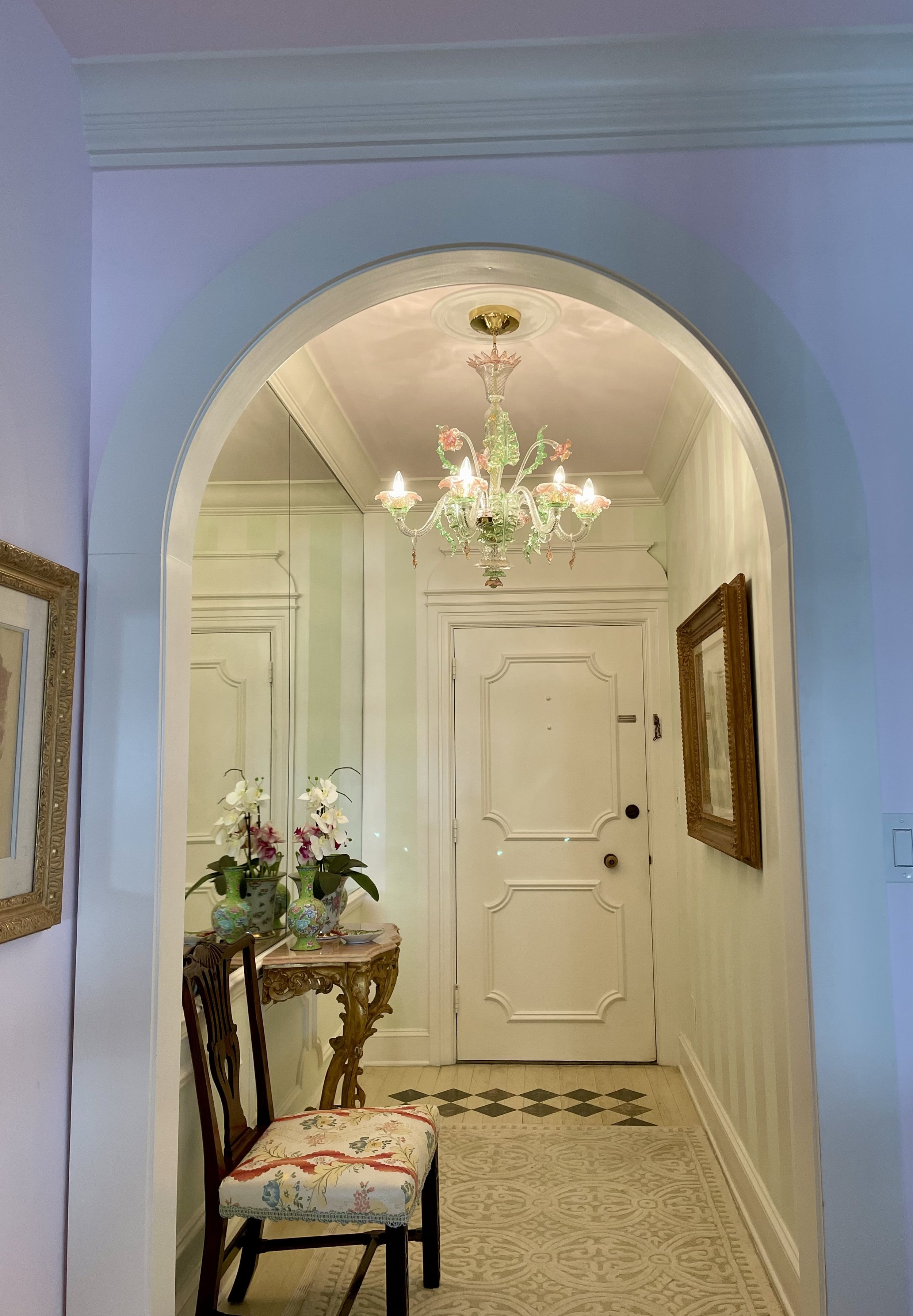
Painting your ceiling a complementary color can be a subtle, yet intriguing detail! The front hall at Petite Fox has the same color pink on the ceiling as on the walls and ceiling in the adjoining living room. I specified 6” wide stripes on the walls. The green is BM Tint of Mint #851, in a flat finish, and the white is BM White Dove OC-17, in semi-gloss finish which adds interest to the surface. The Venetian Murano chandelier contributes to the pink and green theme.
Many have kindly inquired about the color pink on the walls and ceiling in my living room at Petite Fox, our pied a terre in Palm Beach. I am most happy to share my secret recipe!
First, let’s chat about ceilings! Ceilings are considered as the 5th wall, one which can be an unexpected treat for your guests’ eyes. Typically, most guests rarely look up to the ceiling until they begin to feel notably comfortable within their surroundings. When a person first enters a room, naturally, their eyes gravitate from the floor… up to the ceiling.
Contrary to this human behavior, when one is in the presence of a spectacular domed edifice, ornate plasterwork, or a ceiling with gilded embellishments, it is natural to want to look up at the ceiling! Historically, grand ceilings painted by extraordinary artists were meant to impress. This brings back a fond memory of filming my television series in the Music Room at Highclere Castle (aka Downton Abbey), where Lady Carnarvon and I enjoyed afternoon tea and discussed interior design. The baroque ceiling, painted by Francis Hayman in the 1730s, is positively mesmerizing and a pure delight when viewed from below. (The eye candy in this episode is probably why the episode garnered an Emmy nomination!)
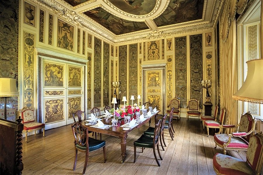
The ceiling in the Music Room at Highclere Castle is stunning. The original canvas was cut to fit the ornate ceiling plasterwork design. Photo credit: Chris McLaughlin / Pinterest
For a historic house, unless there is a precedent for an original design or plasterwork, I honor the tradition of a white ceiling. When the trim is white, then I will specify the same white color on the ceiling, versus an ordinary “white ceiling paint,” Benjamin Moore (BM) in White Dove OC-17, flat finish, is my first choice.
But, for a 20th-21st century interior, and especially for a tropical resort house, why not consider painting your ceiling, the 5th wall, another color besides white? Try using the same pastel wall paint color on the ceiling too, as I did in Petite Fox.
Note how the semi-gloss on the trim adds a lovely hint of sheen against the walls, which are in a flat finish.
So, here is…. my pink paint recipe! BM Pink Peony # 2078-70, cut in half with 50% white, and then use that for the ceiling, so the color is more muted than the walls.
Consider painting the ceiling in a powder room, kitchen, billiard room, baby's room, or laundry room in a shade other than white. You can also request that the wall color be lightened with 50% white.
A ceiling can become the perfect canvas for clever and whimsical art, too.
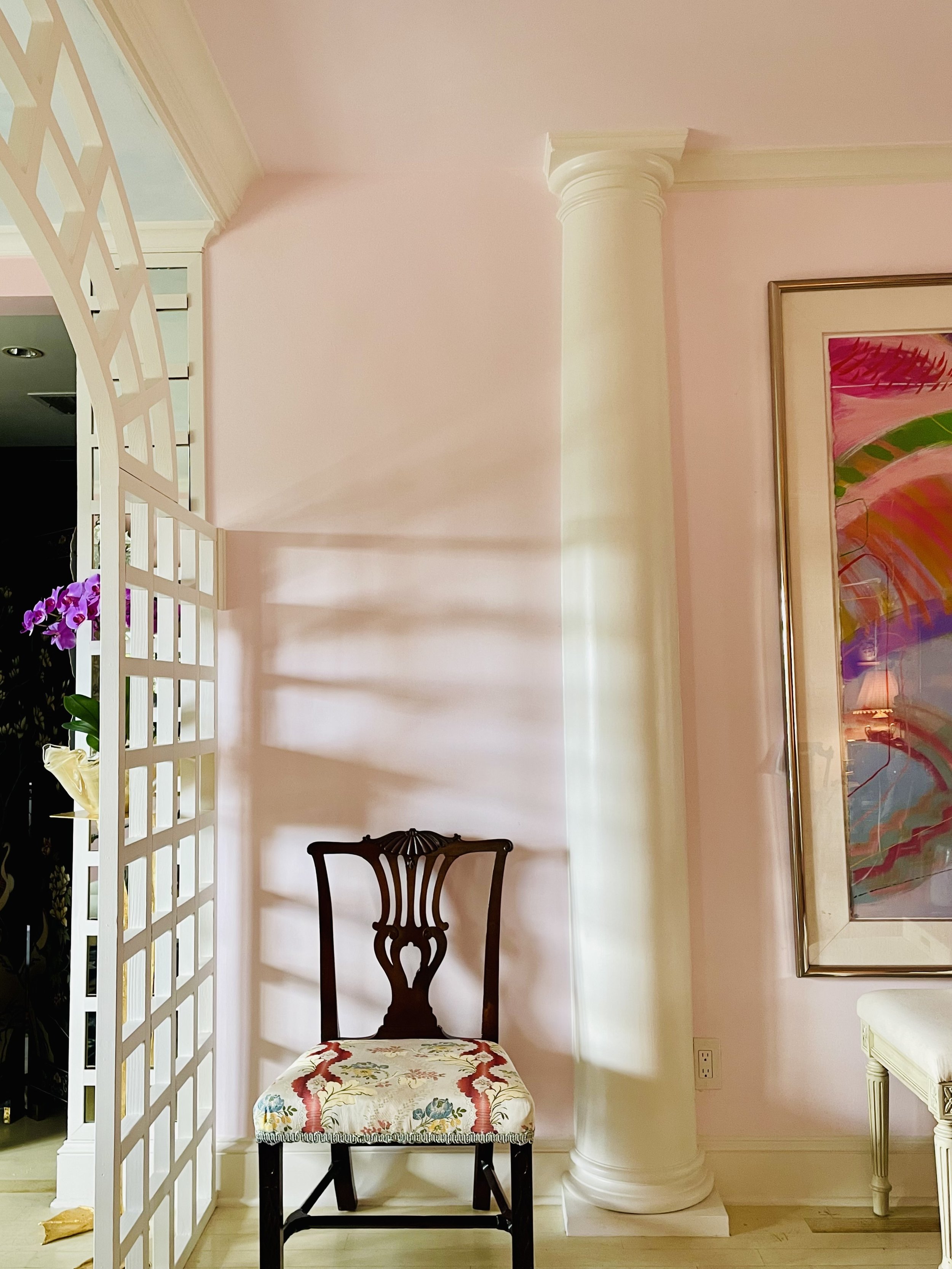
Painting the ceiling pink in a powder room, bathroom, or dressing room is charming and the color will create an atmosphere that is most becoming to anyone’s complexion!
Grandmillennial Tips:
When your wood trim is painted white, i.e. Benjamin Moore (BM) White Dove OC-17 semi-gloss, consider painting the ceiling in White Dove too, but in a flat finish. This gives a room a quiet, understated uniformness.
Consider painting your ceiling a different, yet complementary color to the walls, just for fun!
A flat finish is my first choice for walls. If you have children, an eggshell finish is a bit more forgiving for wiping away those “darling” little fingerprints!
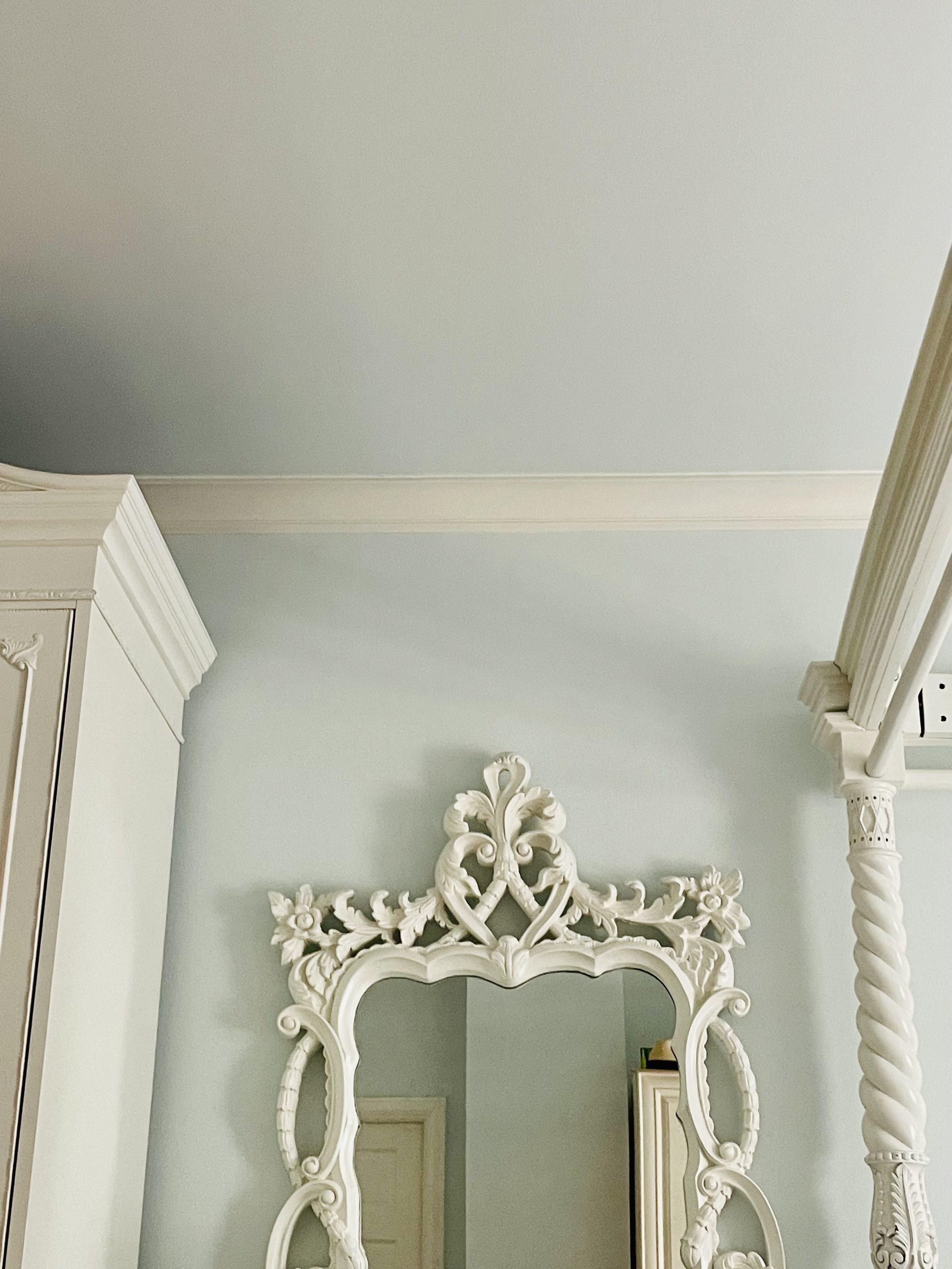
The soft blue walls and ceiling in our bedroom at Petite Fox are BM Winter Ice #866, cut with 25% white, in a flat finish. Both the trim AND the lacquered furniture are in BM White Dove OC-17, in semi-gloss.
When choosing a color, order the large paper samples of the paint color you are considering for your walls, and place them on various walls during the day and night. Better yet, purchase small samples of your paint and try it on the walls. Natural light and artificial lighting make a huge difference in how color is perceived. Your furniture and curtain colors can also have a reflectability on your walls to take into consideration too.
XX Holly
P.S. Please be a dear…share this with a friend and inspire them to subscribe!